
Food & Beverage / Packaging Design
Pogou
A fresh identity, full of flavour.
Bright fruit. Clear character. A family of juice drinks brought together through packaging that puts flavour front and centre.
- Client
- Pogou
- Discipline
- Branding · Packaging & label design · E-commerce
01 / The starting point
The brief.
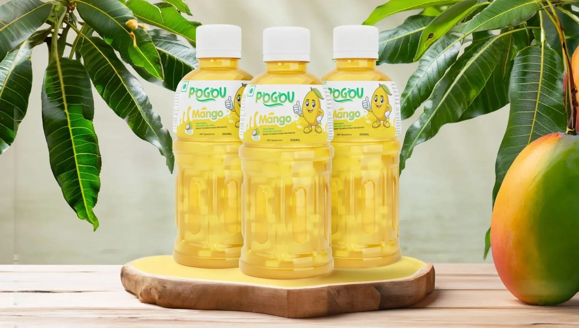
Give every flavour a voice, without losing the family resemblance. For a range of juice drinks, the design needs to make the brand easy to spot and the flavour easy to choose.
Our focus: packaging with appetite appeal, a clear hierarchy and a consistent identity across the range.
One brand. A world of flavour.
02 / The idea
Our approach.
Start with the fruit. Build around the brand. We paired expressive flavour imagery with a recognisable label structure, giving each drink its own character while keeping the range connected.
Colour draws you in. The details help you choose.
03 / The design we created
Made to stand out.Built to belong.
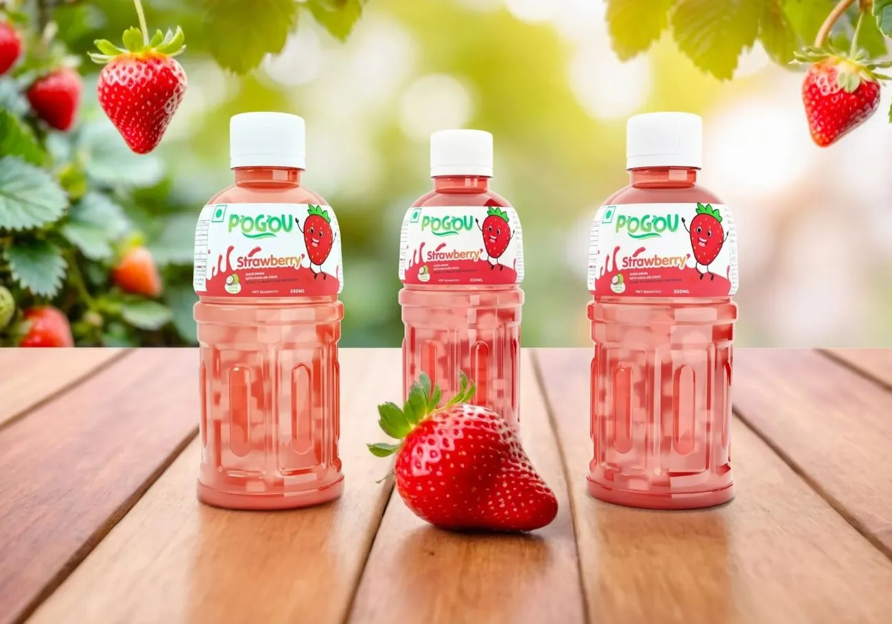
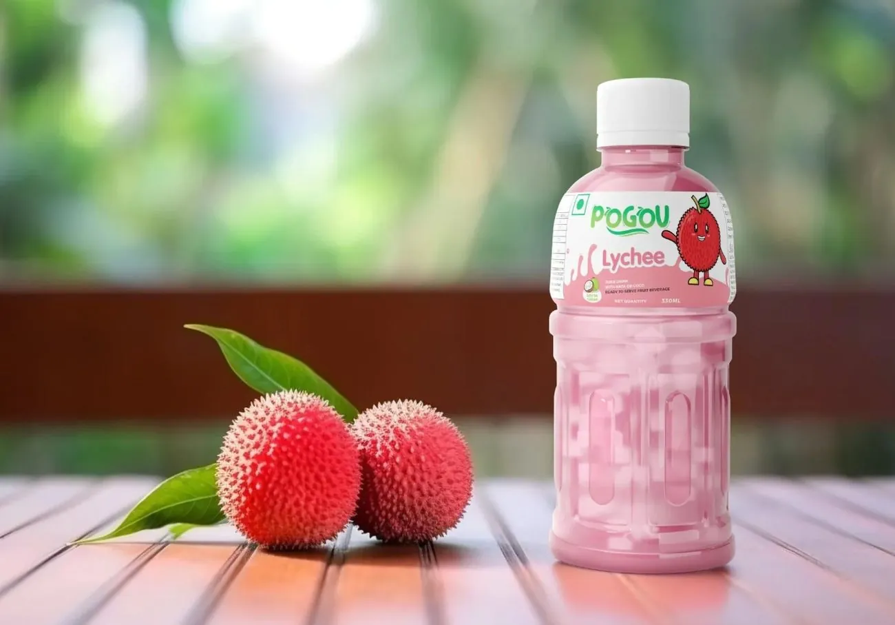
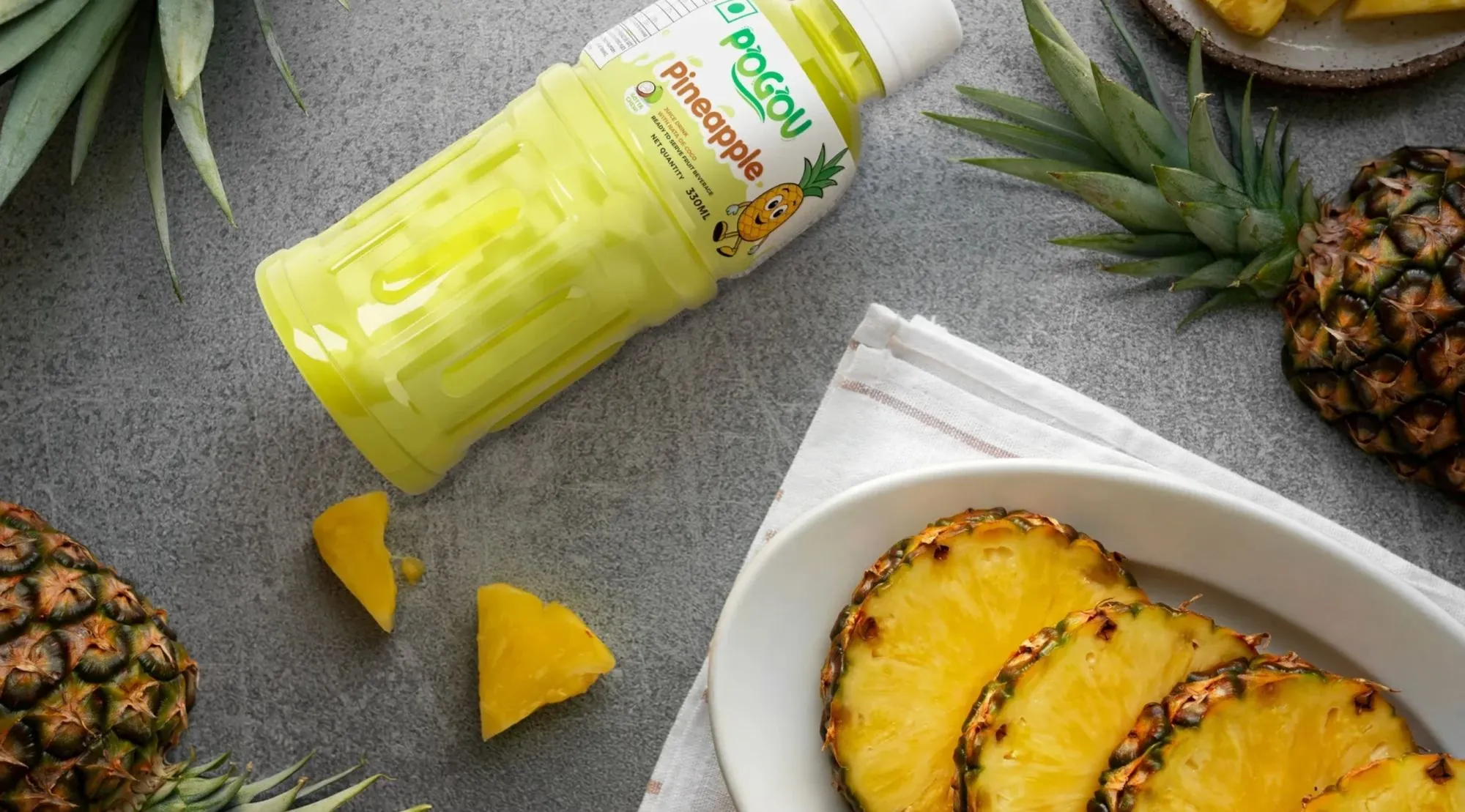
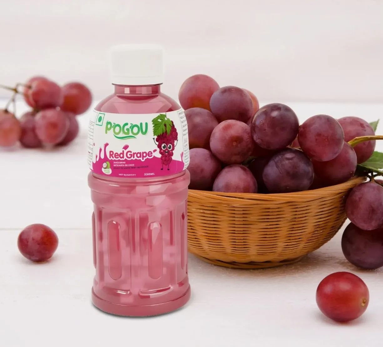
From mango to lychee, the flavour leads the visual story. Fruit-led colours and imagery give each label a distinct personality, with the Pogou identity holding everything together.
A considered system, carried across every pack. Clear on the shelf. Recognisable on screen.
The design system
One idea.Every detailconsidered.
A shared visual language gives the range consistency, with enough room for every flavour to feel individual.
- A recognisable brand presence
- A consistent packaging layout
- Distinctive flavour colours
- Fruit-led imagery and product presentation
Have a similar challenge?
Let’s make your brandimpossible to ignore.
From the first idea to the final pack, we bring every detail together. Tell us what you’re building.
Start a conversation